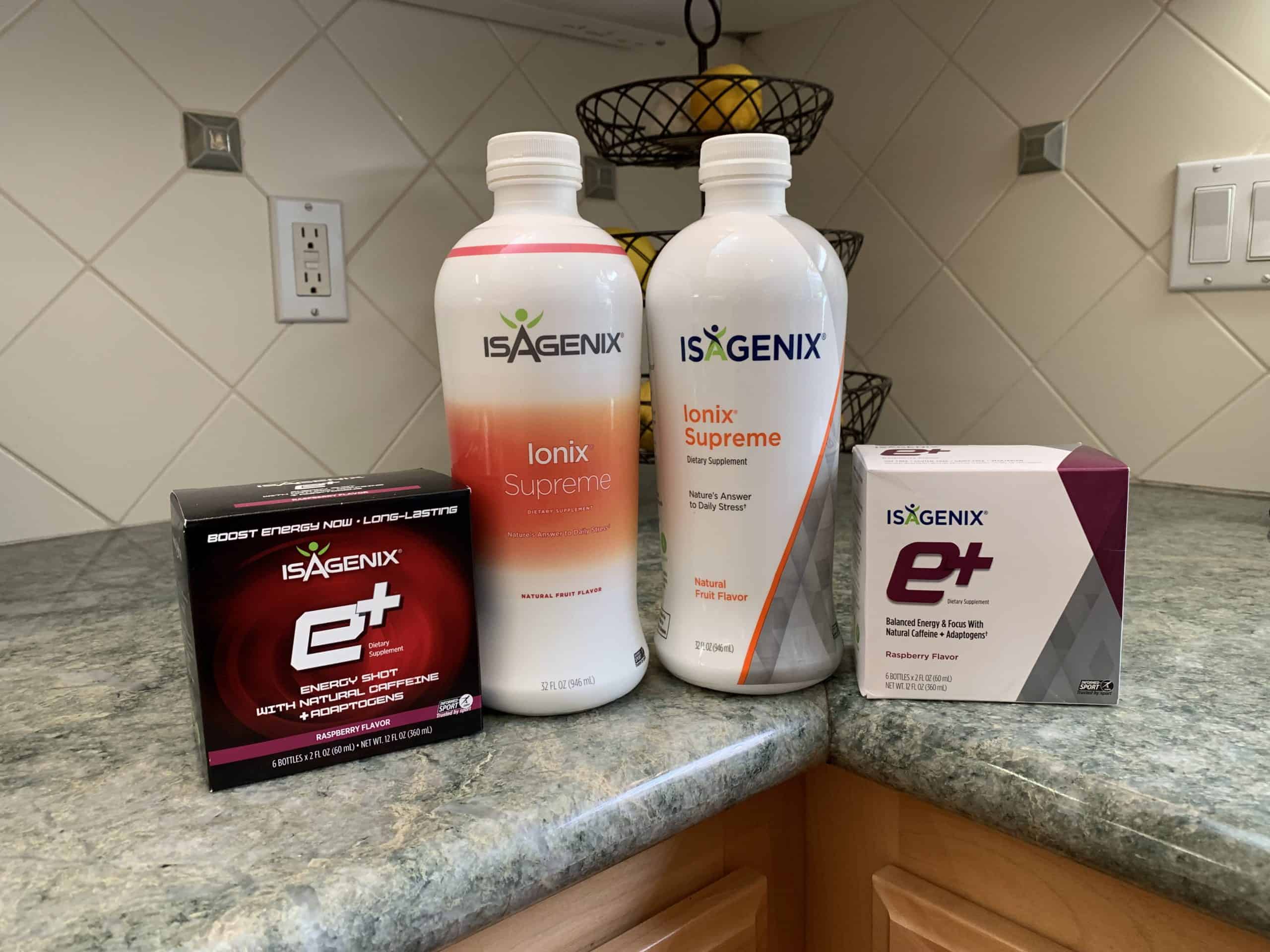
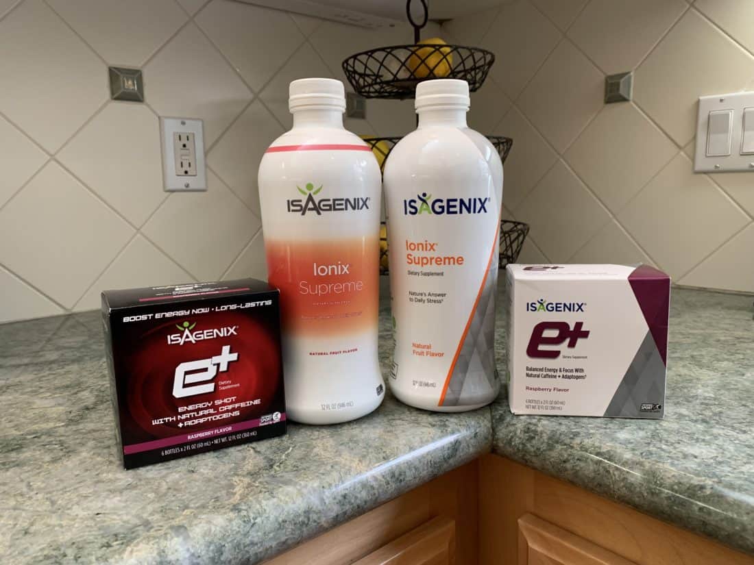
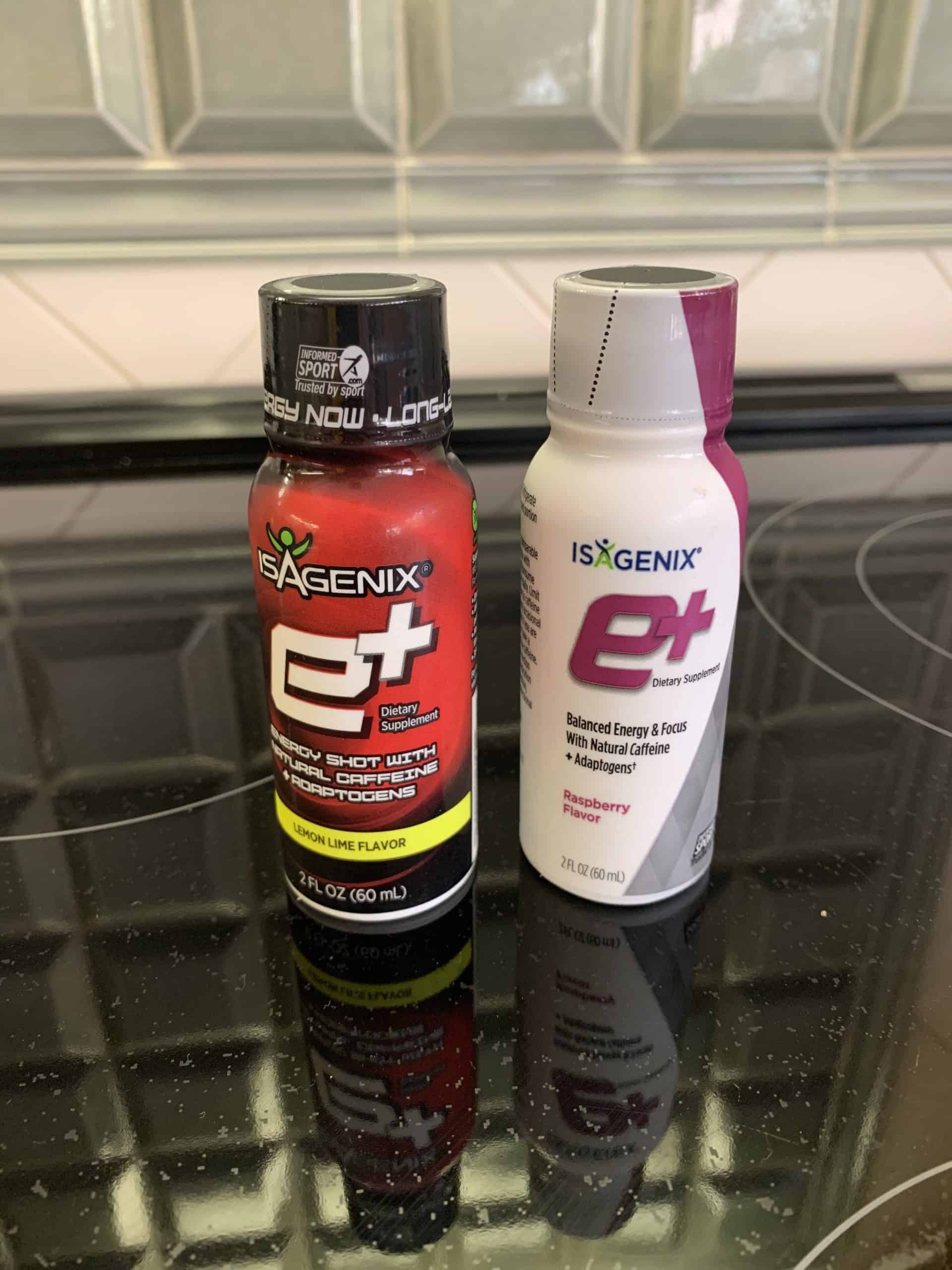
I’m a customer of Isagenix – a global and popular health food and supplement supplier. Earlier in the year, I noticed something different with one of the packages for a vitamin supplement. The following month I noticed the same thing with a supplement package. I pulled a few of the old ones out and compared them with the new ones and sure enough… a full redesign/rebrand. And I like it:
- Modern, fresh design
- The logo was “softened” up a bit by using rounded typeface and by stylizing the “A” more.
- Sharp, diagonal lines w/ slick background patterns
- Minimalistic. The rich black and red background on the old was very dark)
- Clean, open space for text. (The big orange stripe w/ top & bottom gradients is soooo 2000s)
Overall, a good job by Isagenix.


I like the rebrand! I do however wish the rest of the packaging followed their brand colors a bit. Still, great rebrand.
It looks cleaner and fresher.