Project Description
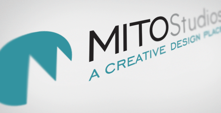
Yes, we designed our own logo ;) In re-branding our name & company, we needed something modern, sophisticated, iconic and fitting to our brand. I’m extremely pleased with the results.
MITO Icon
The “M Icon” started with a plain ole circle that had the corner sliced sliced with a dual mountaintop M to create a forward thinking, unique mark. This icon will be used alone for specific marks such as our Facebook Page icon, website favicon and as a background screen for print/design work, such as our Business Cards.
I feel that is is important to incorporate some sort of Icon / Mark into your logo these days. And it helps to keep it close to square proportions to assist with incorporating into Social Media and other uses.
Typeface
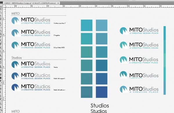
The typeface is a combination of Chisel & Kabel, each a sophisticated San Serif with clean edges and simple lines. “MITO” is in Chisel while Studios and the Tagline are in Kabel. The grey Studios is at 50% black. We applied some tracking, kerning and graphical tweaks to certain areas of the typeface to clean it up and balance it all out.
Colors
The Teal color was selected to promote both a sense of Professionalism and Openness. Our old logo was a solid light navy blue, which is too corporate and ‘official’. Green is quite open, but reserved for specific industries and types of brands. The Teal color we chose provides a perfect balance.
Services Pattern Background
Because we offer so many services, it was unrealistic to simply list or bullet-point all of them. So we created a custom graphic display of all of them in various type-faces, sizes and weights – all rotated at an angle and then repeated across the width. We’ve used this background on our Facebook Page Design, LinkedIn Page Design and the backside of our Business Cards.
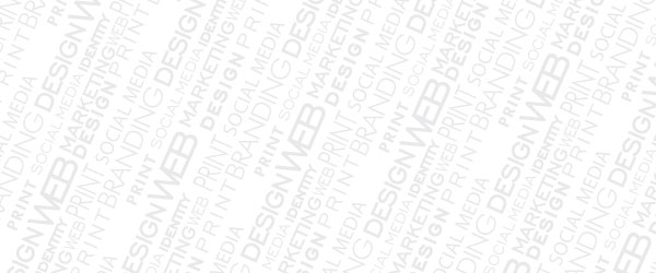
Our “Services Background Pattern” is a unique way to show off the different services we have to offer. It’s used in many of our collateral.
Final Results
Honestly, the overall logo came extremely quick which I especially love. We spent a lot of time tweaking the balance, colors, typefact and overall look and feel, but are super pleased with the end result.


